

American Impoverishment (Part 1)
American Impoverishment (Part 1)
Concrete Failure: A Half-Century of American Immiseration

If the American State was judged on its merits alone (how effective it is at governing), it would have ceased being legitimate a long time ago.
I said that exactly a month ago, as I mused on how abstractions are used to hide concrete failures.
As we focus more and more on the abstract, on GDP rather than "how many hours of work does it take for a median or minimum wage worker to afford a basic but decent lifestyle," on "equality" rather than "how many children live in intact two-parent households in which they see (and spend quality time with) both of their parents every day," we lose sight of the concrete. Some of this is on purpose (see above), but much again is the unfortunate result of fervent attempts to build a better world.
The road to Hell is paved with good intentions. And make no mistake: we are currently on the road to Hell.
I was reminded of perhaps the single most damning example of this concrete failure recently: Cost of Living.
We talk about inflation and "adjusting for 2020 dollars" or other such nonsense, but what really matters is answering the kinds of questions I listed above: "How many hours of work does it take at a median or minimum wage for an individual to afford a decent lifestyle?"
I was reminded of this recently when I saw this picture shared on Twitter:

As one might imagine, I found this profoundly shocking. Could it really be the case that a new house was only 2.5x the average income in 1970? Assuming they mean household income, that would mean the average new house price in the US in 2020 would be around $190-200k, when the actual number is nearly twice that.
But all of this assumes that this easily shareable picture is accurate. Perhaps these figures were massaged in some manner, and not representative of the state of affairs.
So, a case study in How Americans Have Gotten Poorer in the Realest of Terms, featuring Housing and Transportation.
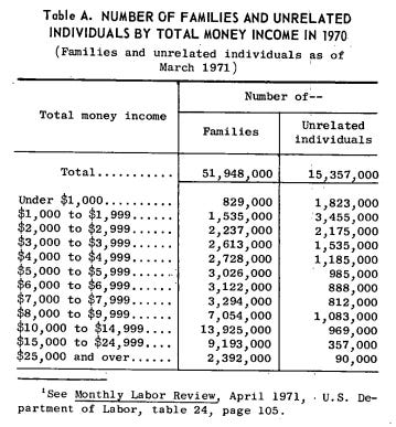
Income
Median Incomes
First, a 1971 report from the US Census Bureau, Income in 1970 of Families and Persons in the United States, gives us information on the median incomes of both individuals and families in the US:
Median Family Income = $9,870
Median Male Income = $6,670
Median Female Income = $2,240
There are various ways you can perform a rough approximation for Median Individual Income on the following data table, but it should be clear here that median individual income is likely somewhere in the $4-7k income range. For the purposes of our calculations (trying to see how much more difficult it is to buy a home on a median salary today vs. 50 years ago), we can take a "conservative" approach and assume that the Median Individual Income is $6k.
Minimum Wage
Here we see the first big break from the data in the picture: the minimum wage for nonfarm hourly workers in 1970 was ~$1.50, not $2.10. Again, being conservative, we can use the February 1971 number of $1.60 as being a reasonable metric.
2020 Numbers
Estimated Median Family Income in 2020 was $78,500 according to the U.S. Department of Housing and Urban Development.
Median Personal Income is a little more difficult to measure, as we don't have clear data for 2020. The latest Federal Reserve numbers are for 2019: $35,977. Estimated annual growth rates for median net compensation have remained under 5% for every year in the past 3 decades. Even so, let's be "conservative": we can say that Estimated Median Individual Income is ~$40,000 in 2020.
So, we have our 1970 and 2020 numbers. At a glance, the median family makes ~8x more money in 2020 than in 1970 and the median individual makes ~6.5x more money in 2020 than in 1970. Have costs increased by 7-8x in the last 50 years?
Housing
1970 Houses
Here, the data for the housing price seems reasonable. The Federal Reserve tracked quarterly median sales prices for houses and here is the data in 1970:
1Q (Jan-Mar): $23,900
2Q (Apr-Jun): $24,400
3Q (Jul-Sep): $23,000
4Q (Oct-Dec): $22,600
Obviously there were different numbers of new houses sold each quarter, but the $23,450 figure in the picture looks reasonable, so we'll stick with that.
2020 Houses
Now for the 2020 median housing price (taken from the same dataset):
1Q: $329,000
2Q: $322,600
3Q: $337,500
4Q: $358,700
We see a fairly constant upward drift here. A simple average is probably the most reasonable estimate for us, considering we lack data on quarterly housing sales (or at least I'm too lazy at this point to go and find said data): ~$337,000.
Comparing Income/House Price Ratios: 1970 to 2020
1970:
Median Household Income: $9,870
Median Individual Income: $6,000 (est.)
Full-time Minimum Wage Work (50 weeks, 40 hrs/week): $3,000
Median Housing Price: $23,450
Median Household Income/Housing Price ratio: ~2.4x
Median Individual Income/Housing Price ratio: ~4.0x
Minimum Individual Income/Housing Price ratio: ~7.8x
2020:
Median Household Income: $78,500
Median Individual Income: $40,000 (est.)
Full-time Minimum Wage Work (50 weeks, 40 hrs/week, $15/hr): $30,000
Median Housing Price: $337,000
Median Household Income/Housing Price ratio: ~4.3x
Median Individual Income/Housing Price ratio: ~8.4x
Minimum Individual Income/Housing Price ratio: ~11.2x
Housing has gotten about twice as difficult to afford in 2020 on the Median income versus 1970, without even accounting for the ~50% increase in the percentage of two-earner households. Even at a $15/hour minimum wage, it is ~50% harder for a minimum wage worker to afford a house in 2020 than in 1970. To bring the ratio down to the same as it was in 1970, we would need a $21.60/hr minimum wage!!!!
Rents: 1970 vs 2000
In 1970, the U.S. Census Bureau reported that the median monthly rent, including utilities, was $108.
In 2020, the U.S. Department of Housing and Urban Development reported that the median monthly rent $1,104. It is unclear if this includes utilities.
While median household incomes have increased ~8x, median individual incomes have increased ~6.7x, and a $15/hr min wage would represent a ~10x increase, median rental prices have increased ~10.2x. Considering that households are now more often two-earner households (see above), the most obvious comparison is median individual income to median monthly rent. It is now 1.5x harder for an individual on a median income to afford median rent in 2020 vs in 1970!
NYC Case Study
Curbed did an interesting case study comparing average rents in NYC from 1940 up through the early 2010s (the piece was published in 2013) and contrasted this to the official inflation rate from 1940.
In 1940, the average rent was $50, according to a market analysis recently digitized by CUNY's Center for Urban Research.
By 1970, inflation meant that the $50 was worth $115-$140, but the average rent was now $335!
By the early 2010s, inflation meant that the $50 from 1940 was worth ~$800. The average rent in NYC? $3800.
What's causing this?
Was it a switch to Fiat? (Hint: No)
I picked 1970 as a starting point because of the initial picture that sparked my interest in this project, not because I'm a secret goldbug.
In fact, let's take a look at the NYC rents case study. The annual rate of price increases during the period of 1940-70 (on the gold standard) was greater than the annual rate of price increases during the period of 1970-2010 (pure fiat):
6.5% annual increase during 1940-70 vs 6.3% annual increase during 1970-2010.
Are houses getting larger? (Yes, but they're getting more expensive per square foot too)
In 1970, the average size of a new single-family home was ~1,500 square feet
In 2020, the average size of a new single-family home was ~2,333 square feet
In terms of price per square feet for a new single-family home, we get:
1970: $15.63/sqft
2020: $144.45/sqft
Median household incomes have increased ~8x while median housing prices on a square foot basis have increased ~9.2x. So it is "only" 15% more expensive to buy a house today than before, no?
Not quite. See, we’re just dividing the median sales price of all houses by the size of new single-family homes.
The median size of a home sold in 2019 appears to be between 1,600-1,650 square feet according to real estate firms Zillow and Redfin. Of course, this is barely larger than the average size of a new single family home in 1970. Which leads to an even more shocking comparison:
1970: $15.63/sqft
2020: $204.24/sqft
So median housing prices on a sqft basis actually appear to have increased by a whopping 13x!
But is a similar phenomenon in play in 1970? That the median square foot of a house sold is lower than the ~1,500 square foot measurement of new single-family homes?
Houses increased in size 43% from 1920 to 1970 and 56% from 1970 to 2020, but we face a conundrum: New houses built in 1970-1980 sold at near-identical prices to already-existing smaller houses.
In fact, it appears as though houses with smaller square-footage increased in price at almost as dramatic a pace as new houses!
Data for existing houses in 1970 is sparse, but even if we take the most conservative case possible and say that the average existing house was only 1,000 square feet, and they comprised ~70% of the market at the time, you arrive at a rough approximation of median size: 1,150 square feet.
1970: $20.40/sqft
2020: $204.24/sqft
A 10.0x increase in housing prices per square foot alongside a 6.7x increase in individual incomes and I think it is reasonable to say that housing is ~50% more expensive today than in 1970 when priced on a square-foot basis.
New houses increased in size by ~16% in the 1970s and ~20% in the 1980s. Even accounting for declines in average household size, the claim that increases in prices reflect increases in living space seems, again, dubious at best.
Similar trends exist in the 21st century with rents on a square-foot basis becoming 59% more expensive from 2005-2020, while median personal income has only increased 25% in the same time period.
Even when controlling for house size, it appears housing has become significantly more expensive for the average person to afford. And assuming a diminishing marginal utility to personal space, it seems unlikely we would see the rapid price increases in the last 50 years as household size declined. Instead, one would expect that the “tiny house” phenomenon might be more widespread as a symptom of actual demand, not as a symptom of absurd prices. Instead, pricing per square foot has continued to increase rapidly, even as average household size has largely leveled off.
Obviously, a proper analysis would likely need to take some nationally representative sample of houses of various sizes and trace their prices through the past 50-100 years, seeing if price/sqft increased or not. But I think it’s fair to say that price increases are not primarily driven by increasing the size of houses.
Is it price of inputs?
Maybe, but I've seen no good argument for this, and I find it highly difficult to believe that we are somehow less effective at producing the inputs for building houses and buildings now as we were 50 years ago.
Is it a restriction on housing supply?
No. In 1970, an estimated 75mn housing units existed. In 2020, an estimated 142 million housing units existed.
On both an individual and household level, housing units have exceeded population growth from 1970-2020.
1970: 204mn people, ~65mn households
2020: 331mn people, ~130mn households
While housing supply being restricted might make sense as an explanation in particular areas, it doesn't apply nationally.
Housing-as-Investment
Louis Hyman, economic historian at Cornell and author of Debtor Nation, had this to say:
“One of the reasons why I think there’s an explosion in bigger houses, more expensive houses, is the more money you can [get a bank to give you], the more money you can make as a homeowner…You borrow as much as you possibly can, you buy the biggest possible house you can, and then you can make more money on the upside if you think house prices are going to go up.”
While proving this theory would require a dissertation-tier study, I find it more plausible than most of the other theories on this list. It would better explain the disconnects in housing price from underlying “objective” measures like size, supply, etc. The extension of consumer credit is its own problem deserving of investigation, but this section has gone on far too long.

Transportation
New Car
According to Edmunds, the average new car price in 2020 is ~$40,000.
The average new car price in 1970 was $3,542.
So, median individual income increased ~6.7x and new car prices increased...11.3x. Wonderful.
Gasoline
I know, picking a year just before the oil crisis is a bit cheating, but price per gallon of gas in 1970 really was $0.36. In 2020? $2.17. Gasoline, of all things, actually has gotten slightly cheaper compared to median individual income. A pittance, and of all the places this is not where you want prices relative to income to go down, considering the various energy crises we need to deal with.
Conclusion
Inflation in an aggregated sense is a useless statistic. What matters is the ability of a given wage level to purchase a particular quality of life. It is becoming harder and harder for individuals to afford the necessities of life. We have lived through a half-century of American immiseration, masked only by cheap trinkets and flashy screens. If we want to develop a society that works for all of us, perhaps it is time we decide how to make acquiring at least basic housing, good healthcare, and quality education an attainable goal for all Americans. The latter two issues deserve their own explorations, and they'll receive them in due time. We need to measure Core goods (Housing, Healthcare, Food, Transportation, and to some degree Clothing and Education) in terms of the burden on median and minimum incomes. Inflation simply doesn’t cut it as a measurement, and punishes the vast majority of Americans.
If you survived one of my data-heavy posts, congratulations! Clearly I need to make time to get good at making graphs.
But if you enjoyed, join the email list and consider a paid subscription to support my work!
Check again https://ideasanddata.wordpress.com/2021/03/26/how-bad-has-the-us-economy-become-for-regular-people-1970-2020/
Henry George was right